Creating Visualizations
This page will show how you can create visualizations with Hubble and Google Looker Studio.
By the end of the tutorial you will have created two graphs that will help visualize temporary VS persistent contract data entry distribution and expiration.
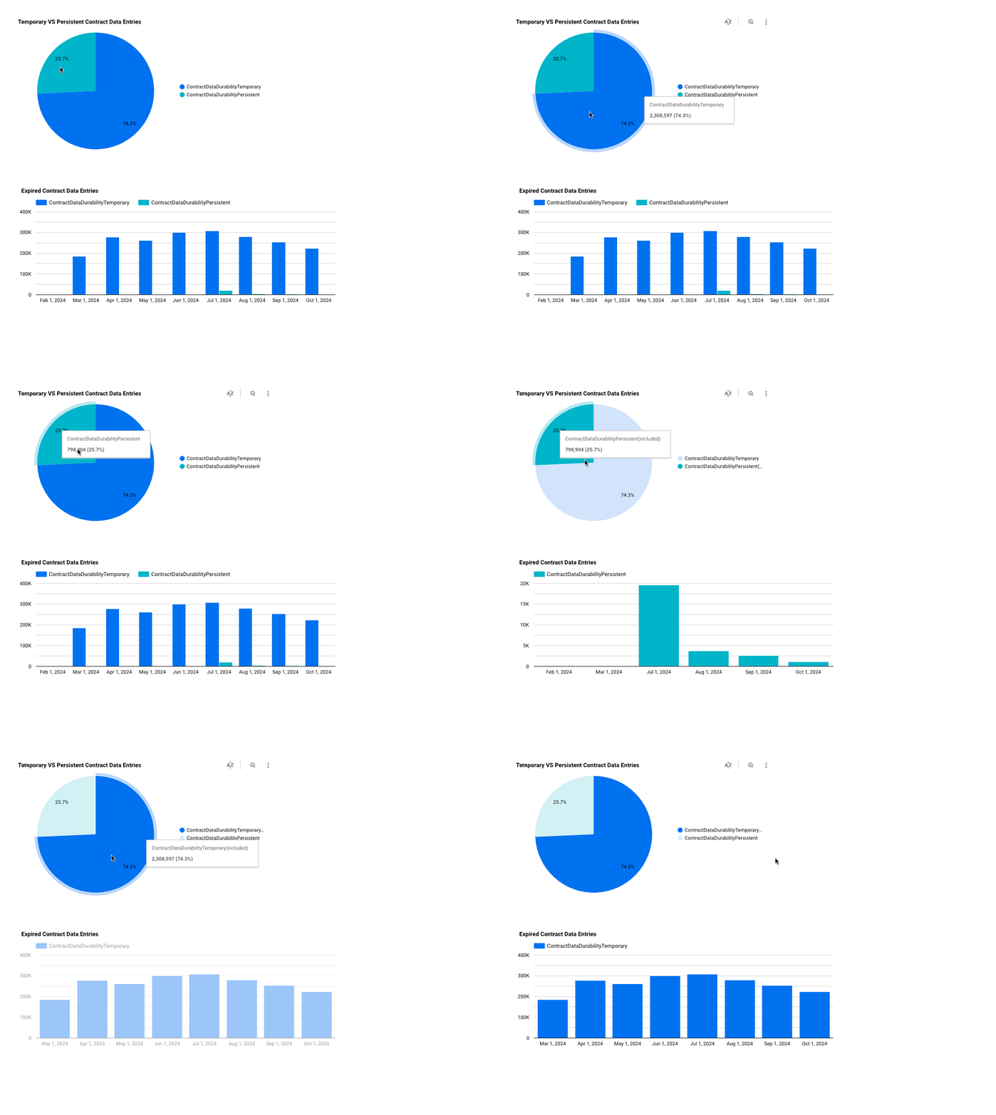
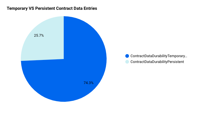
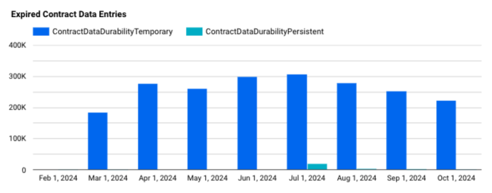
As you can see, persistent contract data entries account for roughly 25% of all contract data entries with the rest being temporary. There are also a lot more expired temporary contract data entries. This is expected because temporay entries cannot be bumped whereas persistent entries can be bumped/restored. For more information, you can read about State Archival and the Contract Data Lifecycle.
Prerequisites
- Make sure you have connected to Hubble by following the instructions in the Connecting page
- You have access to Google Looker Studio
- You have read and understand the general Best Practices for querying BigQuery data
Create a Report in Looker Studio
Attach Data Sources to Looker Studio
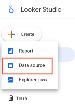
- Select
Create --> Data source
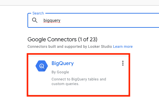
- Find and select the
BigQuery Google Connector
- Find the desired tables that you want to connect. For this example you will want to add a data source for:
crypto-stellar.crypto_stellar.contract_data

Create a New Report (Dashboard)
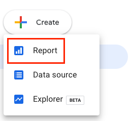
- Select
Create --> Report
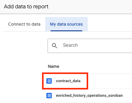
- Add your data sources from above
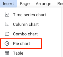
- Insert a
Pie chart
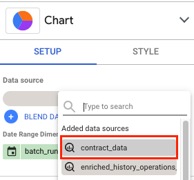
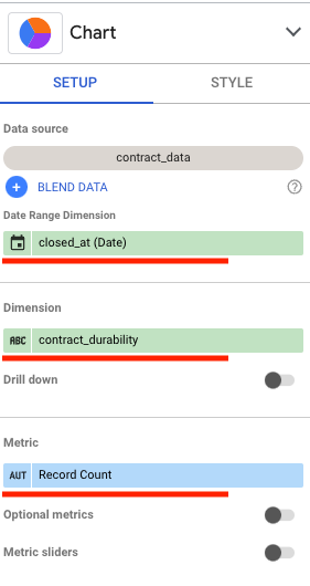
- Choose
contract_dataas theData source
- Choose
closed_atas theDate Range Dimensionandcontract_durabilityas theDimension
- You should now have a pie chart showing the percentage of Temporary VS Persistent Contract Data Durability
Use Custom SQL to Create a Chart
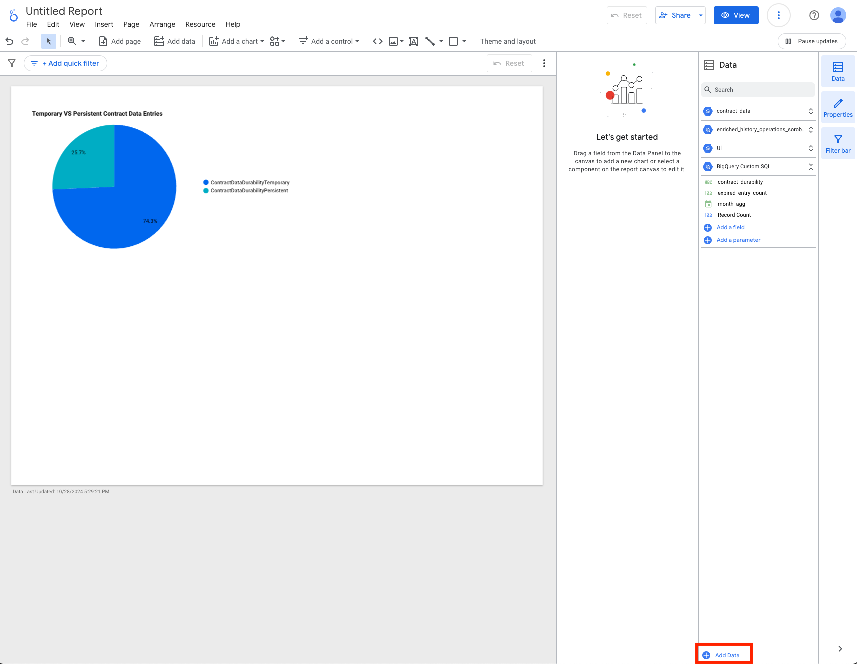
- In your report, click
Add Datawhich will be near the bottom right of your window
- Select
BigQueryand chooseCUSTOM QUERYand select your desiredBilling Projectwhere the query will be charged
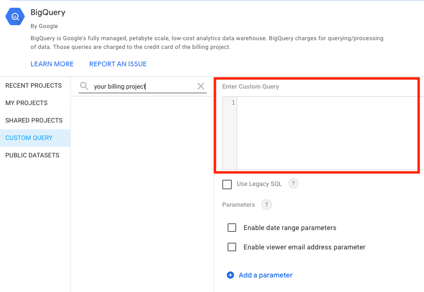
- Add the following query and click
Add
-- Find the latest ledger sequence within Hubble.
-- This may be slightly behind the actual Stellar latest ledger
-- because Hubble is scheduled to run and insert data at 10 minute intervals
with latest_ledger_in_hubble as (
  select
    max(sequence) as latest_ledger_sequence
  from `crypto-stellar.crypto_stellar.history_ledgers`
),

-- Find all the ttl that have expired
expired_ttl as (
  select
    key_hash
    , live_until_ledger_seq
    -- Saving the date to aggregate on at the final step of the query
    , date(closed_at) as ledger_date
  from `crypto-stellar.crypto_stellar_dbt.ttl_current`
  where true
    -- Filter for expired entries only with the use of latest_ledger_sequence
    and live_until_ledger_seq < (select latest_ledger_sequence from latest_ledger_in_hubble)
)

-- Aggregate based on the month and contract durability type
select
  date_trunc(et.ledger_date, month) as month_agg
  , cd.contract_durability
  , count(1) as expired_entry_count
from expired_ttl as et
  join `crypto-stellar.crypto_stellar_dbt.contract_data_current` as cd
    on et.key_hash = cd.ledger_key_hash
where true
  -- Optionally filter for a specific date/date range
  and et.ledger_date between '2024-02-01' and '2024-10-31'
group by 1,2
order by 1 desc, 2
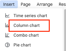
- Insert
Column chart
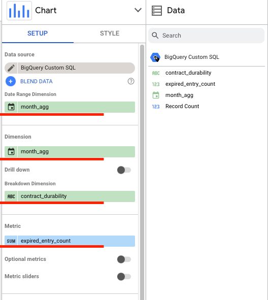
- Select the following:
BigQuery Custom SQLas yourData sourcemonth_aggas theDimensioncontract_durabilityas theBreakdown Dimensionexpired_entry_countas theMetric
- You should now have a column chart (bar chart) showing the expired Soroban contract entries
Applying a Global Filter
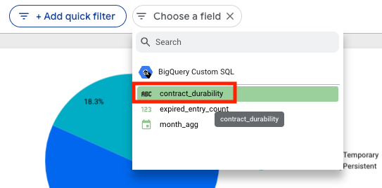
- Click
+Add quick filterto apply a filter throughout the whole report
- Select
contract_durabilityto filter bycontract_durabilityvalues
- Select only
ContractDataDurabilityPersistentand clickApply
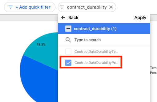
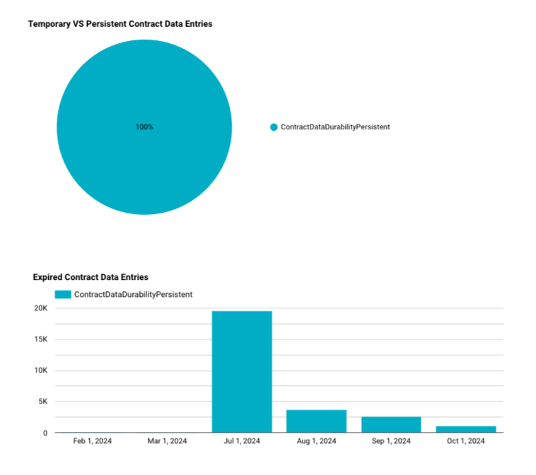
- Your charts should now be filtered and show only
ContractDataDurabilityPersistentdata
